OPI: My Vampire Is Buff

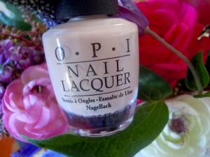
myvampisbuffbottleDoes this polish remind anyone else of Spike? From Buffy? A buff, pale vampire? No? Just me? Okay.

I’d like to tell you guys that I have missed you! Life has gotten busy and I haven’t been dedicating enough time to my nail polish habit, but I have missed keeping up with the trends and hopefully finding more interesting colors to add to my collection.

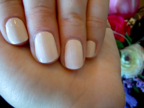
I’ve been on a search for a nice almost white polish for a long time. As we know, it’s hard to find the shade we have in our heads and My Vampire Is Buff isn’t quite it, but I do think it’s quite nice.

Creamy, cool biege-y white

Creamy, cool beige-y white

My Vampire is Buff is a cool, creamy white beige. A nice, light neutral.  It doesn’t have much pink / fleshy tones to it. I like that it’s a cool toned almost white color. Although I am fairly warm toned, in the dead of winter (can I get some sun please?) cooler toned polishes look alright on me. Although I think I will like this one a lot more in the summer when I have a bit of color to me. Overall though, I think this color is very pretty and a nice addition to my collection.

I didn’t have much difficulty with the formula. I have heard some complaints of it being a bit streaky, but for a polish of this color, I actually thought the formula was pretty good. I only used two coats, with the first one thicker, and everything evened out and covered just fine.

Where to Buy: Ulta / JCPenny / Dillard’s / Professional Salons / Trade Secret / Online Retailers / $ 8.50

Okay, tell me. What’s your favorite color from the OPI Euro collection? Did you pick up My Vampire is Buff? Any others I should add to my collection? I want to hear from you guys, I’ve missed chit chatting about polish!

– Liz

3 Comments

Filed under OPI

Sally Hansen Complete Manicure: Plum Luck

plumluckbottle It sure has been awhile hasn’t it, guys? The hiatus wasn’t planned, but life has gotten far busier than it once was so not only my nails but also Death By Polish. I hope to be back in touch with you all. And want to wish everyone a happy holiday season! I’m ready for some snow.

I’m under the impression that Sally Hansen is eliminating this polish line since I recently bought a few for a mere $2. I haven’t had the best luck with this line s it isn’t surprising to me, but for some reason did really like this polish.

A deep, well balanced plum

A deep, well balanced plum

Plum Luck took me by surprise. I bought it mainly because it was cheap and looked decent. But once applied, the color looks different from the bottle; to me it ends up being deeper and more “wine” colored, which I really like. I like that it ends up having a darker tone and more red than I anticipated. Finding a good balance of red and purple in “wine” is difficult and this one has a very nice balance. I also think that this polish would work well for the holidays, the deep red / purple tone feels somewhat festive to me.

I used three coats for full coverage and had zero issues with formula. I did out of habit apply a base and top coat with this polish, even though it isn’t “necessary” with this polish line.

Where to Buy: Drugstores, Target (if still available) / $ 2 – $ 8

Can anyone confirm if Sally Hansen is filtering out this line of polishes? Was anyone else also less than impressed with the quality of this polish line? Did you pick up Plum Luck or any other of the Complete Manicure polishes on clearance and were surprised by them?

– Liz

3 Comments

Filed under Sally Hansen

A Rhyming Dictionary: A Rhyming Dictionary

I’ve been blogging here on Death By Polish for a long time. It’s been about 3 years, which is crazy! And recently I was contacted by Morgan from A Rhyming Dictionary Polish for the first time to review her set of polishes based on the Oz books. I’m very flattered and excited to blog about them. This one caught my eye first (How could it not? A blue flakey? Come on!), and I couldn’t wait to use it.

Saturated blue jelly with flakies

This polish is really fun. As I always say, I love blue polish. This polish is so pretty in the bottle; it’s a bright, poppy saturated blue packed with different shaped iridescent blue, purple, and violet flakes. The flakes are really interesting in this polish and it makes it very special. I do think this polish would look even better layered over another blue polish to brighten it up and make it shine. I look forward to using it again and layering it for sure!

I had no issues with formula on this polish. Although it’s not fully opaque, I used three coats and got good coverage. It went on smooth and also dried easily. In the past, I have noticed independent nail polish brands have an overly strong odor, but did not notice it with this one.

Where to Buy: http://www.etsy.com/shop/Arhymingdictionary / $ 7.50

Do you like this fun, flakey blue polish? Have you seen or purchased any of the A Rhyming Dictionary polishes? Have they caught your eye on Etsy or other blogs? Are you now interested in giving them try?

– Liz

1 Comment

Filed under A Rhyming Dictionary

China Glaze: Riveting

I remember when the Hunger Games polishes first came out, I was very interested in this polish. But then somehow forgot about it when I started to pick up specific polishes from the collection. But recently on an Ulta splurge, (it was a bad one) I found Riveting in the clearance bin and was thrilled since I had forgotten all about it.

Fire-y orange with metallic gold shimmer

Riveting is a loud polish. With that being said, I actually found it to be pretty wearable and flattering. Most of you know that I am not a red polish girl, and this polish somewhat straddles that line. However, since (to me and on me) it does read more orange, it makes it more interesting and “hip”. The golden shimmer is packed in heavily, and really lights up the polish. It really does look somewhat like a burning orange sunset or a campfire. I find it to be pretty unique and a really great end of summer / into fall polish.

I had no issues with formula with this polish. I ended up using two coats for full coverage. The polish was very saturated and pigmented, but went on very smoothly.

Where To Buy: Online Retailers / Ulta (Clearance) / Sally’s (Clearance) / $ 4 – $ 6

Did you jump on Riveting right away when the Hunger Games collection was released? Do you like this fire-y orange red? Or have you seen it before? I think it would also be very fun and appropriate pedicure for fall!

– Liz

1 Comment

Filed under China Glaze

OPI: Don’t Pretzel My Buttons

This may sound a little crazy coming from me, but I couldn’t wait to wear this polish. And even crazier, I love it. Of all the Germany collection polishes that I’ve tried, this is my favorite thus far.

Warm, nude creme

Though this polish seems a little bland, something about it is extremely flattering and pretty. It’s a warm, beige, nude-y creme. Although it seems very warm and pale, this polish was a pretty awesome looking mannequin hand manicure on me. This polish hit all the right notes for me and I can’t wait to wear it again.

Easy application, even for a creme

Cremes can be fussy, but I had no issues with Don’t Pretzel My Button’s formula. It went on smooth and very even for a creme. I used three coats to be safe, and got full coverage. As far as application tips, I’d just let each coat dry fully since cremes can drag easily.

Where To Buy: Ulta / Trade Secret / Dillard’s / JCPenny / Professional Salons / Online Retailers / $ 8.50

Let’s hear it, do you agree that Don’t Pretzel My Buttons is pretty? Or is it a bit boring for you? Did you pick this polish up? Do you want to?

– Liz

9 Comments

Filed under OPI

OPI: Every Month Is Oktoberfest

Okay, I am attracted to a lot of the polishes in this fall’s Germany collection. There’s something about the range of colors and them hitting the right note of interest for my color preferences. I picked up a few last weekend, and I’m sure I’ll be adding to them shortly. 🙂

I would like to say I did have trouble photographing this polish. I think it was the warm morning light, so I apologize. I don’t like doing that to you guys, but I think it still reads pretty accurate to what the polish looked like on skin.

Shimmering, vampy, purple / red, with golden shimmer

Every Month Is Oktoberfest caught my eye right away. It’s a dark, shimmering plum. On first coat, this polish seems to be a little wimpy and a bit sheer. But by the second coat, it builds up to this interesting deep, purple / plum with golden and warm shimmer that really comes out in the sun. Otherwise this polish does read mostly as just a metallic in natural lighting. This polish reminds me of something Zoya would do for a fall foil, it’s rich and fresh. I think it would look really great of fairer skin than mine.

I had no formula issues with this polish, I did three thin coats and got full coverage and depth. I do think the formula was a bit thin, which is why I chose to do three thinner coats to achieve full coverage.

Where to Buy: Ulta / JCPenny’s / Dillard’s / Professional Salons / Online Retailers / $ 8.50

How are you feeling about the fall OPI Germany collection? Are the polishes as interesting to you as they are to me? Or do they seem repetitive to you? Which one if your favorite so far? I’d love more recommendations to pick up!

– Liz


4 Comments

Filed under OPI

Zoya: Zuza

 I’ve been wearing a lot of blues lately, and Zuza was an untried I hadn’t gotten around to yet. The pretty watery, mermaid-y blue is obviously something I was drawn to.

Sparkle-y aqua green

Zuza is a fun manicure. It’s a pretty, medium toned aqua with a touch of green. The finish on this polish was interesting to me. The silver shimmer read almost as a foil to me, but seemed to be just a little short of the full on sparkle that a foil has. I’m not going to say this polish is the most unique, but it was fun to wear and great for summer.

Easy, smooth application

In typical Zoya fashion, this polish applied very easily. The formula was smooth and I had no coverage issues. I used two thick coats and everything turned out well.

Where to Buy: Zoya.com / $ 8

Do you like Zuza? Did you buy Zuza? What did or didn’t you like about this polish?

– Liz

6 Comments

Filed under Zoya

Zoya: Tracie

I was looking forward to the polishes I ordered on that 3 for $15  Zoya promotion from a few weeks back. Although a lot of summer collections are very predictable, I liked the look of the blues and greens in this seasons summer collection so I snagged them. But I was pretty disappointed in Tracie.

Pale, almost pastel, metallic green shimmer

I was a little apprehensive of this polish once I saw it in person; it was light, almost pastel in tone and didn’t really carry the “oomph” I want from a green polish. It’s a bit soft and tame for my taste. It’s also a hard color to describe. It’s not mint, but it’s still light and yellow toned. It’s more of a “spring” green with a fine, dense shimmer that reads as a metallic finish on the nail. Overall, Tracie isn’t very flattering (and I have warm toned skin) and the elements in the polish don’t work together in a way to make it interesting or pretty.

Very bad formula

However, the real issue with this polish was the formula. I honestly don’t think I have ever said that a Zoya polish had an unbearable formula, but this one does. I was almost shocked. The formula was so sticky and goopy that it had the consistency of a very old polish. It was difficult to spread on the nail, which caused issues with the manicure being even. I used three coats, which gave me an okay overall look, but I was not happy with the formula and application by any means. I was very surprised since Zoya usually delivers buttery, smooth cremes and easily applied foils like pros.

Where To Buy: Zoya.com / $ 8

Did you buy Tracie? Did you encounter any formula issues? Or was I perhaps given a fluke bottle? Does this color at all interest you? Does it read as a “summer” color to you?

– Liz

6 Comments

Filed under Zoya

Zoya: Wednesday

Hey all. I hope you’re all getting time to enjoy summer and the warm weather. It’s by far my favorite time of year and I’ve been enjoying sitting out on the patio relaxing and admiring my flowers.

I apologize for my lack of posting recently. It’s not that I don’t enjoy writing about nail polish anymore or don’t enjoy polish anymore; it’s that it’s been really difficult for me to find new collections that really pique my interest enough to want to purchase them. I feel like many collections have been quite repetitive and nothing new or exciting. I still want to chit chat and connect with all of the wonderful readers of DPB so, as always, I’m keeping my eyes peeled for new polishes to wear and write about.

Wednesday is just one of those colors that will suck me in everytime. I could have my own helmer drawer for turquoise-y green-y blues. This polish did look a little dustier to me in swatches then it ended up being in real life.

Shiny turquoise-y blue

Although this shade is quite common, I couldn’t help myself. As mentioned, I did think Wednesday would be a little dustier or a slightly more interesting tone via swatches, but I’m pretty sure it matches most of my other turquoise cremes, silly me. I do think it has a nice balance in it, and it’s definitely blue (to me) so there’s no lobster hands in sight.

Very nice formula and application

The formula and application on this polish was really great. It applied like butter to my nails, very smooth and opaque. I used two coats for full coverage. It was super quick and easy application.

Where to Buy: Zoya.com / $ 8

Did you get any of the Zoya Surf and Sun polishes? Did you pick up Wednesday? Which is your favorite? Or did they seem pretty standard for a summer collection?

– Liz

5 Comments

Filed under Zoya

Rescue Beauty Lounge: IKB: 2012

Although my RBL stash isn’t large by anyone’s standards, I am a big fan. I appreciate the attention to detail from Ji and the company and think they always have interesting colors and stories that draw me in. However, my bank account hates when that happens.

IKB: 2012 is from the fan collection. I literally couldn’t wait to get my hands on this electric blue; it couldn’t be any more my taste.

Jelly / creme electric blue

First of all, this polish wasn’t easy to photograph. In real life, it is deeper and darker than these photos display. I apologize for not being 100% color accurate. However, the way these photos turned out is more so what I thought the polish was going to look like. I was expecting a bright, radiating blue. But it is darker and more purple than I was expecting. It dries semi-matte, so this leads me to believe there’s some neon pigment in the formula, but it’s not as bright as I was hoping or expecting. I wanted it to be a bit louder. I still actually love this polish a lot, but I did have a different pre conceived idea of it.

Somewhat tricky formula

I heard the first batch of these fan polishes had formula issues, but they were to be resolved. I didn’t have much issue with the formula on IKB: 2012. The first coat did go on pretty uneven and sparse, but by the second coat it really covered my nails and was almost completely opaque. I did do another thin coat (3 in total) just to make sure everything was perfect. It also dried quickly thanks to the neon pigment (I think). I did do this manicure last night, and already have tipwear though. Not what I like to see from a $20 bottle of polish, to be honest.

Where To Buy: RescureBeauty.com / $20

So let’s hear it! Did you end up buying any of the RBL fan collection? Did you get IKB: 2012? If not, which color was most interesting to you? Did you like the idea of fans of the line being able to win and developed their own polishes?

– Liz

1 Comment

Filed under Rescue Beauty Lounge